talahú.design
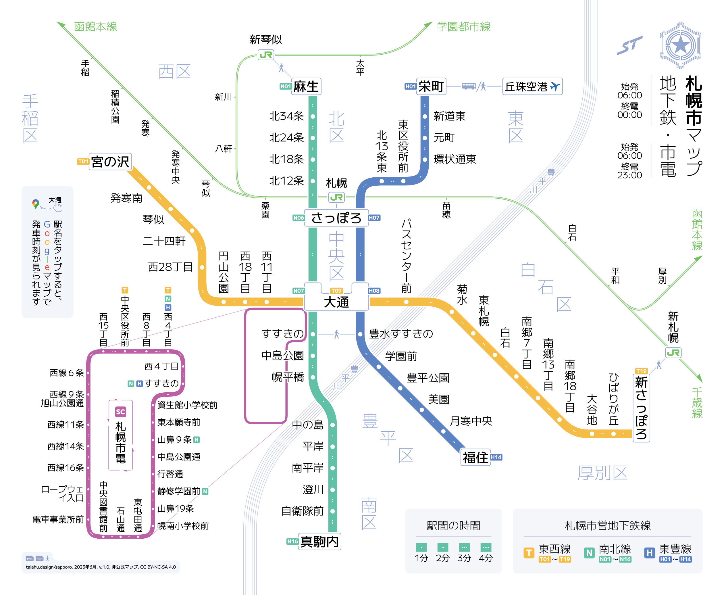
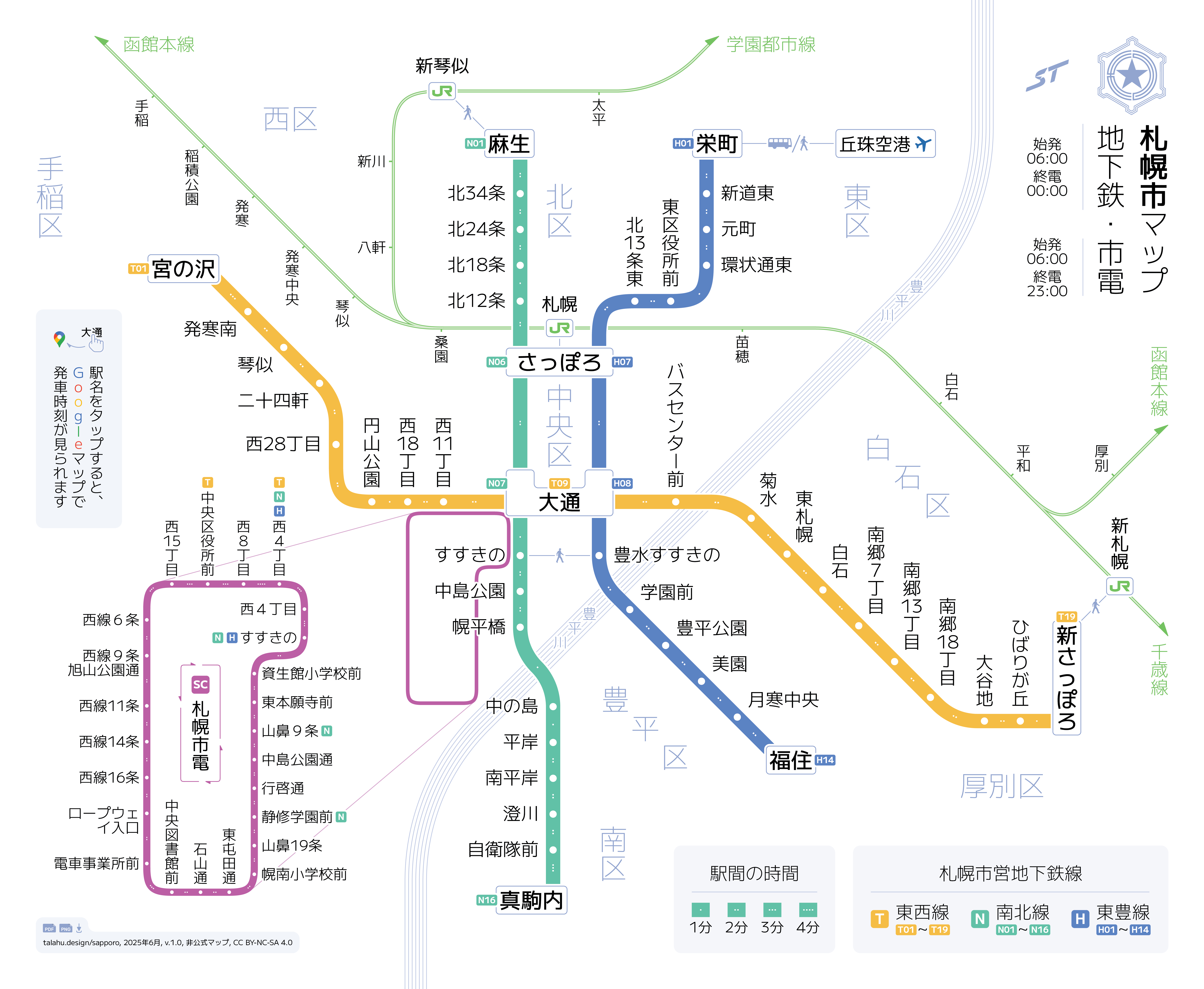
Sapporo Metro & Streetcar Interactive Map
 2 MB
2 MBThis project was mostly an excuse to play around with two things that are new to me.
Connecting to Google Maps
The first thing I wanted to try was making an interactive map where you could click or tap a station name in the PDF version and get redirected to Google Maps, showing both the area around the station and live departure info.
This turned out to be surprisingly easy to do, thanks to Google Maps’ public geocoding API. I could generate links for each station programmatically with a tiny Python script, without having to search stations one by one.
There’s at least one case where this approach breaks, though. I do include the line name in all my queries to help the API find correct stations, but in the case of 白石 (Shiroishi), which is the name of two different stations in Sapporo, this does not work for some reason. Google still redirects both to the same station.
Either way, it was a fun experiment!
Japanese Typography
I've been wanting to design something in Japanese for a while, because I like the aesthetics of the script and would like to see what it’s like to work outside the constraints of Western typography.
Japanese has a few features that are incredibly useful for things like transit maps. Free choice between horizontal and vertical writing makes it much easier to squeeze station names between lines, and full-width characters align neatly in both columns and rows, producing cleaner layouts.
That said, I don’t actually speak Japanese, so there’s a good chance I’ve misapplied some typographic conventions. I’d love to hear feedback, especially from Japanese speakers!